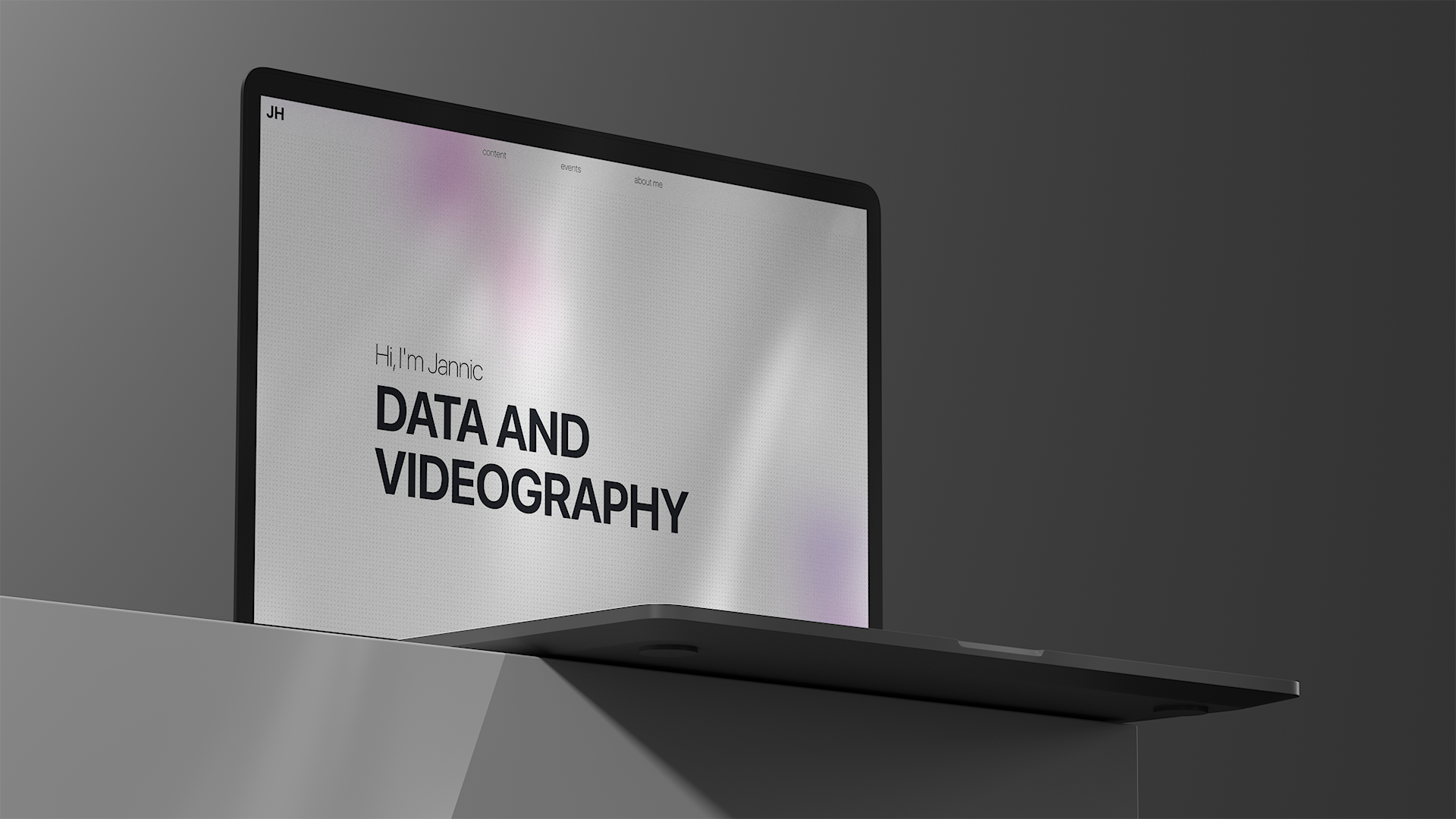
How I Built My Personal Portfolio From Scratch
I do a lot of things—in a lot of different places... shapes, colours, and sizes. And I love it. Whether it’s prototyping something on GitHub, writing a blog post, giving talks through my work, or collaborating on creative projects with my full-time artist friends, I find so much joy in all of it. There’s just too much cool stuff out there not to dive in and get involved.
But with all these projects being so different and scattered across platforms, I started running into a weird problem: where do I send someone if they want to see "my work"?
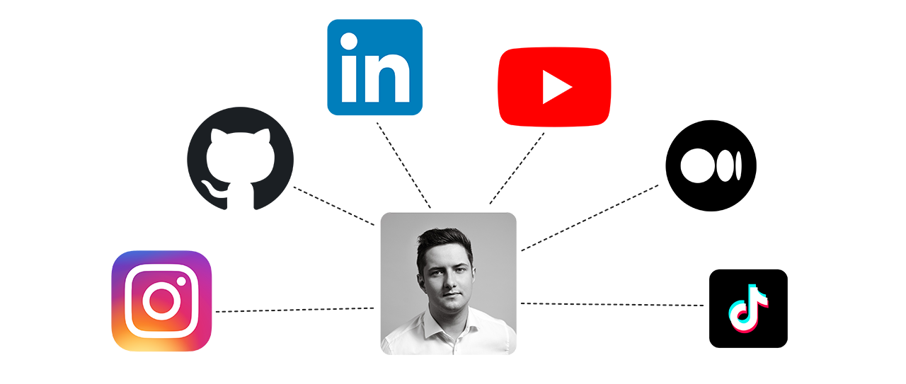
For years, my answer was context-dependent. If someone wanted to see my creative projects, I’d point them to my Instagram or YouTube. For more technical endeavours, I’d link them to GitHub or LinkedIn. And honestly? That worked. It was fine. But it never felt really satisfying.
Here’s why: I could never provide a full picture without overwhelming people with a dozen links. Plus, some projects had this fragmented existence—like a YouTube tutorial connected to a code repository and a blog article, each sitting on a different platform. It felt like trying to explain a long-distance relationship to someone who just wanted to see a happy couple in one place.
What I really needed was a home for everything. A gallery. A space where I could showcase all my work while tying together the pieces that lived apart. Sure, you could call it a portfolio, but I wanted something more personal. Not just another generic showcase, but a place uniquely tailored to the range of things I do—a portfolio with personality.
This idea wasn’t new. I’d been toying with the concept of a virtual showroom for years. Back then, it was mostly about the video projects I did for clients. But as time passed, the need to build something for all my work grew stronger. Good thing I love learning and trying new things, because that’s what kickstarted this journey: to build my very own blog/portfolio/gallery from scratch. But turning that idea into reality? That’s where the real fun—and challenges—began.
Turning a Scatter of Projects Into a Unified Vision
This wasn’t my first attempt at building something like this. Over the years, I’d toyed with various approaches, but one goal always stayed the same: make it easy for someone to explore all the things I do.
Sounds simple, right? Well, it kind of is—until it isn’t. Let me explain.
There are two main dimensions to consider. First, there’s the topic: Is it about a cutting-edge AI model architecture? A piece on data regulation? Or maybe a behind-the-scenes look at a video shoot for a brand campaign? There’s quite a range in the projects I do. Then, there’s the type of media: code, blog posts, videos, livestreams, meetup presentations—sometimes all of these at once.
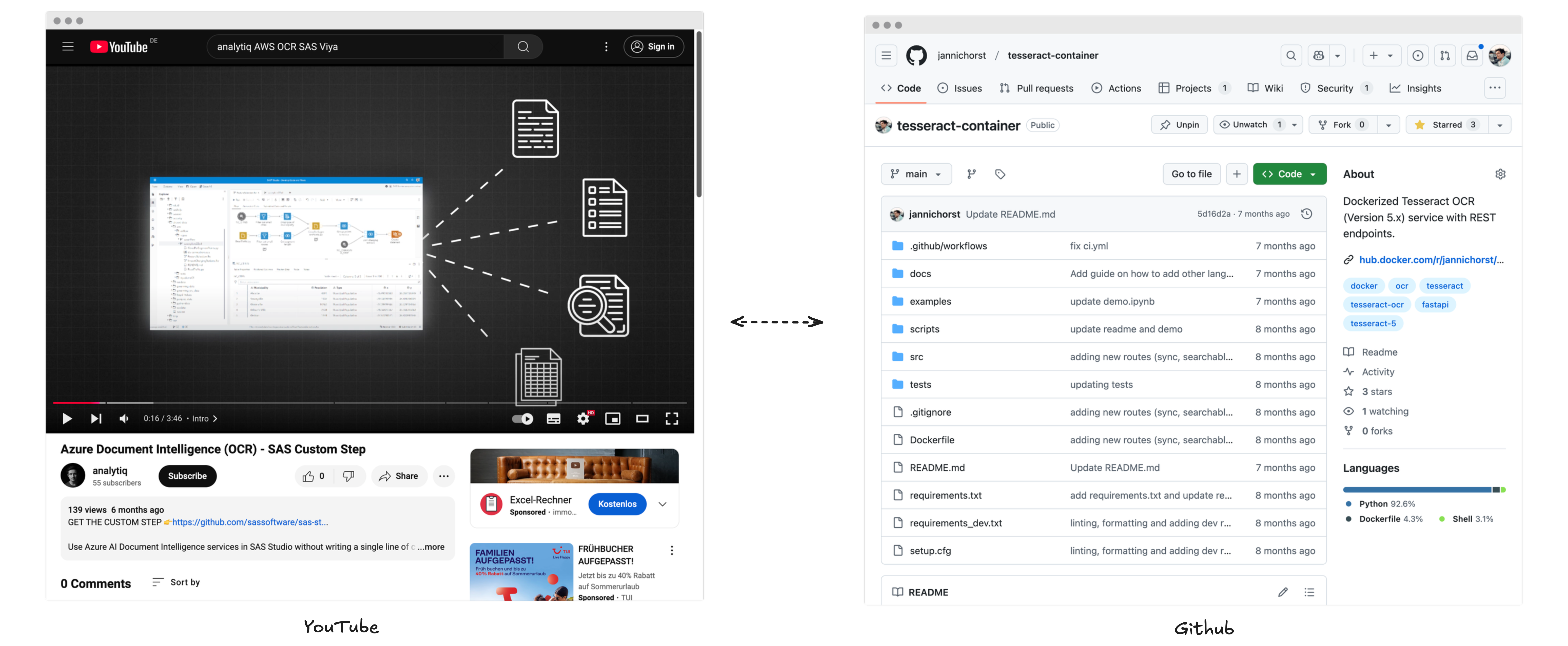
Even if I ignore the topic for a moment, just figuring out how to meaningfully present these different formats in one place is a challenge. Just try to imagine what the baby of YouTube and Github would look like... Yeah, It’s… a lot. And then there’s the wildcard: an explainer article that might live on some external blog. Keeping all these pieces accessible while making the experience intuitive and consistent turned out to be the first big puzzle I needed to solve.
So, before writing a single line of JavaScript, I had to start with a concept—a framework that could handle the variety of topics and media while staying simple to browse, read, and enjoy. That’s how my journey began. Step one? Opening my browser and typing… figma.com.
Designing the Blueprint: From Vision to Sketch
While it might sound a bit overblown to create a full prototype for a portfolio site (don’t worry, I didn’t go that far), starting at the literal drawing board was important to me for two reasons:
- I wanted to solve my main problem before diving into implementation.
- I wanted my page to look good.
The second reason might sound trivial, but aesthetics matter to me. Sure, in some circles, caring about design might not be a core competency, but for me, it reflects a part of who I am—my “artistically driven” side. I wanted the end result to feel clean, non-distracting, and just a touch personal, with a bunch of carefully made design decisions.
As every good artist does, I opened my browser and started steal… gathering inspiration. From beautiful personal portfolios to content-heavy sites like YouTube and Apple News, I took screenshots of layouts, components, and ideas that resonated with my goals. With this collection, I began filtering the elements I liked and sketching the basic structure in Figma.
I decided to keep things simple and started with three core components:
- A hero section to welcome visitors to the site.
- A content overview that would let users browse my work.
- Individual content pages for diving into specific projects.
Over time, I iterated and added new ideas, but these three formed the foundation. Design is an iterative process, and instead of walking you through every tweak and revision, I want to focus on two key goals that shaped my decisions: Reflecting Me and Creating One Place for All My Content.
Reflecting Me: Aesthetic and Intuitive
Designing the site to reflect me wasn’t just about picking a nice color palette—it was about creating something that felt authentic. I’ve always valued minimalism and clarity, so I leaned into a clean, intuitive design with muted colors and a sleek font. These choices not only aligned with my tech-focused work but also are supposed to let my projects be the star of the show, not the site itself.

Every design decision had a purpose:
- Visitors should reach the content overview with a single click or scroll.
- Accessing a specific post? Just one more click.
- Want to explore other related topics? One more click again.
This simplicity wasn’t just about usability; it echoed how I approach my projects—straightforward and functional, but at t
he same time clean and polished. The design elements also extended to functionality, like embedding videos front and center while maintaining a cohesive structure for blog posts and code repositories. I didn’t want a flashy site that overshadowed the content. Instead, I aimed for something understated yet engaging, like a well-organized gallery.
One Place for All My Content: Unifying the Chaos
The second goal—creating a single home for everything—was trickier. How do you unify projects that span videos, code, blog posts, and more without losing coherence? The answer lay in breaking things down piece by piece.
I started with the post page. Inspired by YouTube’s layout, I made sure every post had a thumbnail to create visual consistency. Videos became the star of their respective pages, but I also added contextual buttons for easy navigation—think links to my YouTube channel, GitHub repo, or even external blogs. This way, each post offered flexibility for mixed formats, like a video tied to a code project.
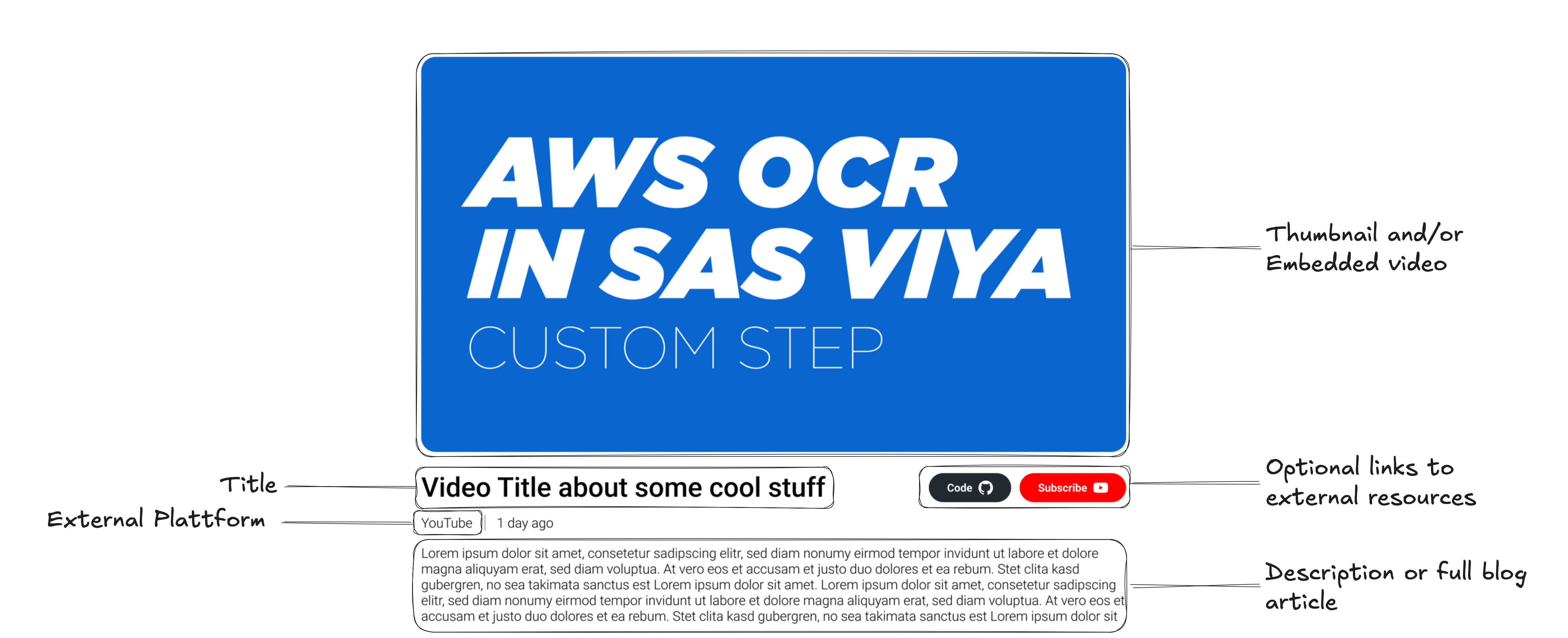
Blog posts needed their own structure. A clean text section under videos with options for embedding images or code blocks made the page both functional and aesthetically pleasing. For code specifically, I implemented custom component with syntax highlighting that was not only visually consistent but also makes it for users easy to copy.
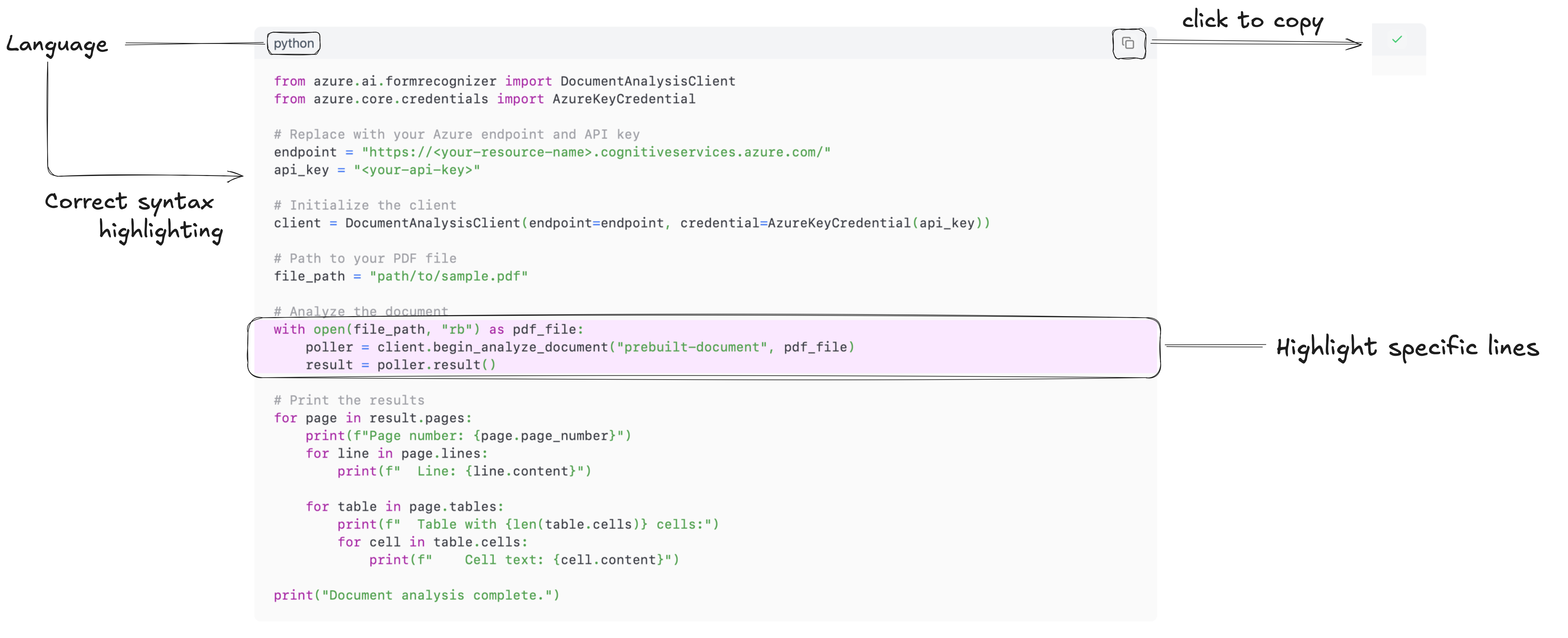
Tags became the final touch. Each post received both topic-related (e.g., Data Science, OCR, Azure) and qualitative (e.g., Tutorial) tags. Clicking on a tag leads visitors to a curated page of similar content, making discovery intuitive and seamless.

Finally, I tackled the content grid—the gateway to all posts. I initially planned to categorize posts by type (e.g., video, blog, code), but realized that most of my projects were hybrids. A video often accompanies a code repo, and a blog post sometimes adds context to both. Instead of over-complicating things, I treated each project as “a post” while ensuring visual consistency and clear navigation.
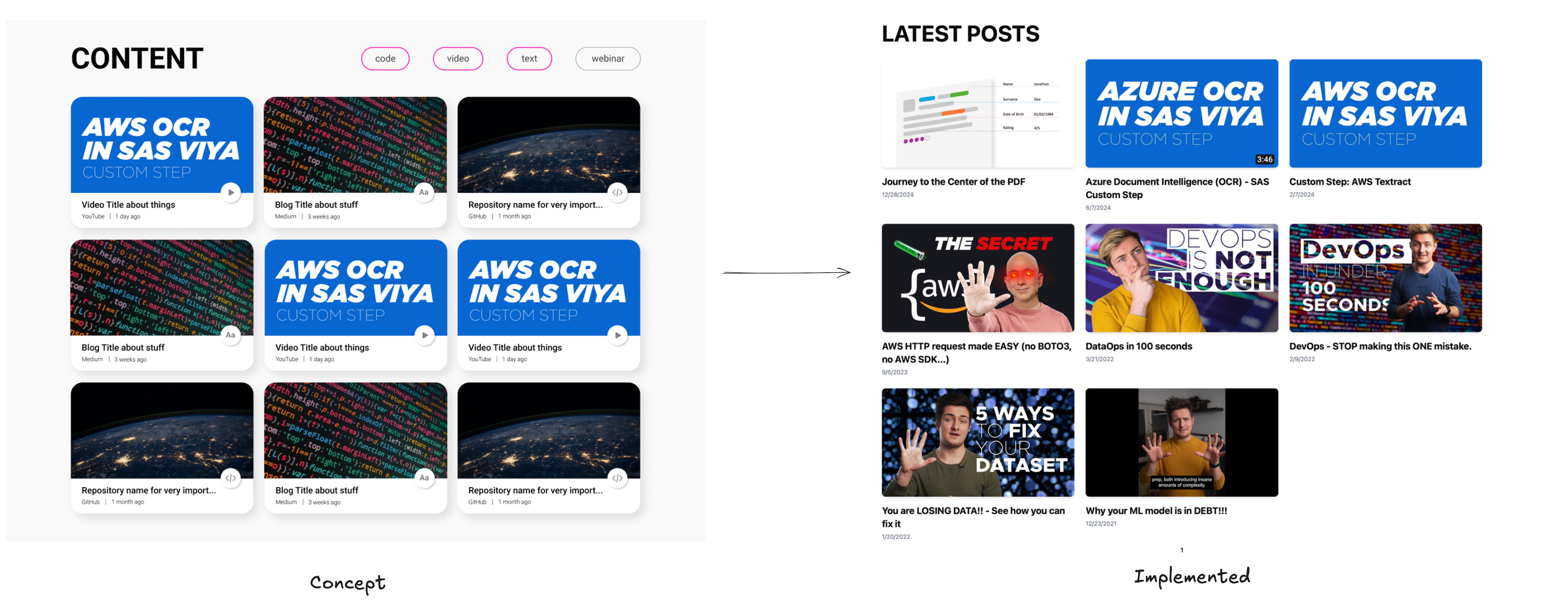
Closing Thoughts on Design
After a lot of iterations and experiments, I reached a point where the UI/UX concept felt right. The next step? Rolling up my sleeves and bringing it to life. Time to open VSCode.
Building the Engine: Choosing the Tech Stack
As someone who usually works with data, AI models, and broader decisioning systems, diving into web development was both exciting and intimidating. My experience with frontend technologies? Let’s just say it was… limited. On the plus side, this meant I was free to pick and learn whichever tools fit my needs. On the downside, my choices were, at times, very much "vibes-driven."
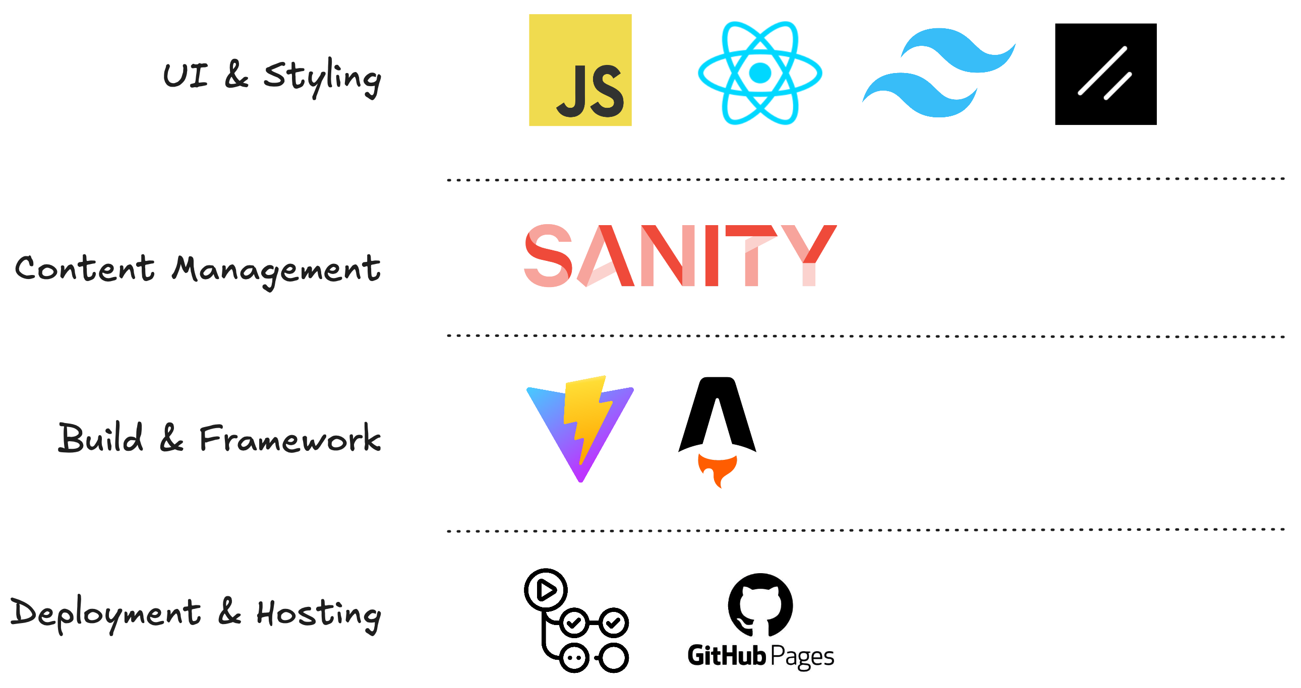
Over the years, I’d picked up bits and pieces about frontend development from following creators online. I knew what JavaScript, React, and Tailwind CSS were—but only superficially. Still, one name kept popping up in my feed: Astro.
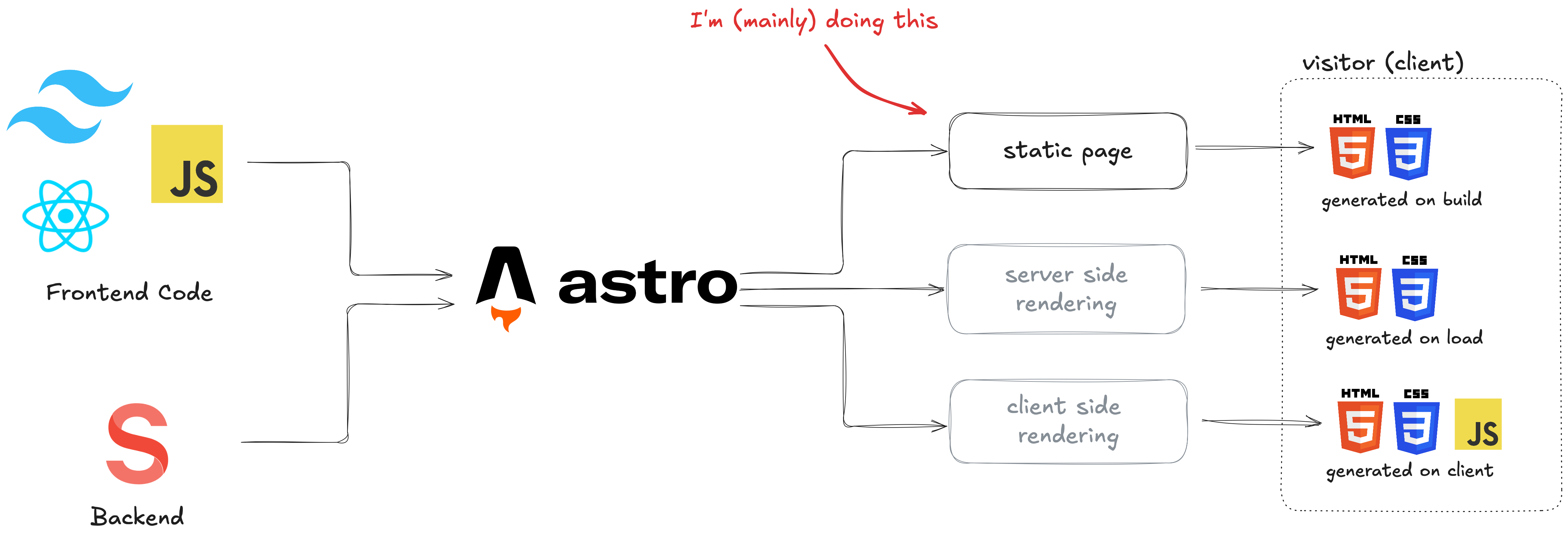
For those not in the know, Astro is a framework designed for building fast, content-heavy websites. Its standout feature? It only sends static HTML and CSS to the browser by default, rendering every page at build time. No heavy JavaScript for the user’s device to load or execute, meaning blazing-fast speeds. In practical terms, it allowed me to write JavaScript without worrying too much about how performant my code was. Even if I committed some “coding war crimes” (as a novice web developer might), the result would still be a smooth experience for the visitor.
Another reason Astro felt like the perfect fit? The static nature of my portfolio. Unlike a constantly updating feed on a social media platform, my site would only change when I uploaded new posts—a cadence of days or even weeks. With static pre-rendering, the site could remain lightweight and efficient, no matter how many projects I added.
Managing Content: Beyond Markdown
Initially, I thought about leaving all my content in the repository as Markdown files. After all, Astro handles Markdown beautifully. But the idea of cluttering my repo with dozens of .md files, images, and accompanying assets felt chaotic. I also wanted a better way to edit and manage posts, something more streamlined and user-friendly.
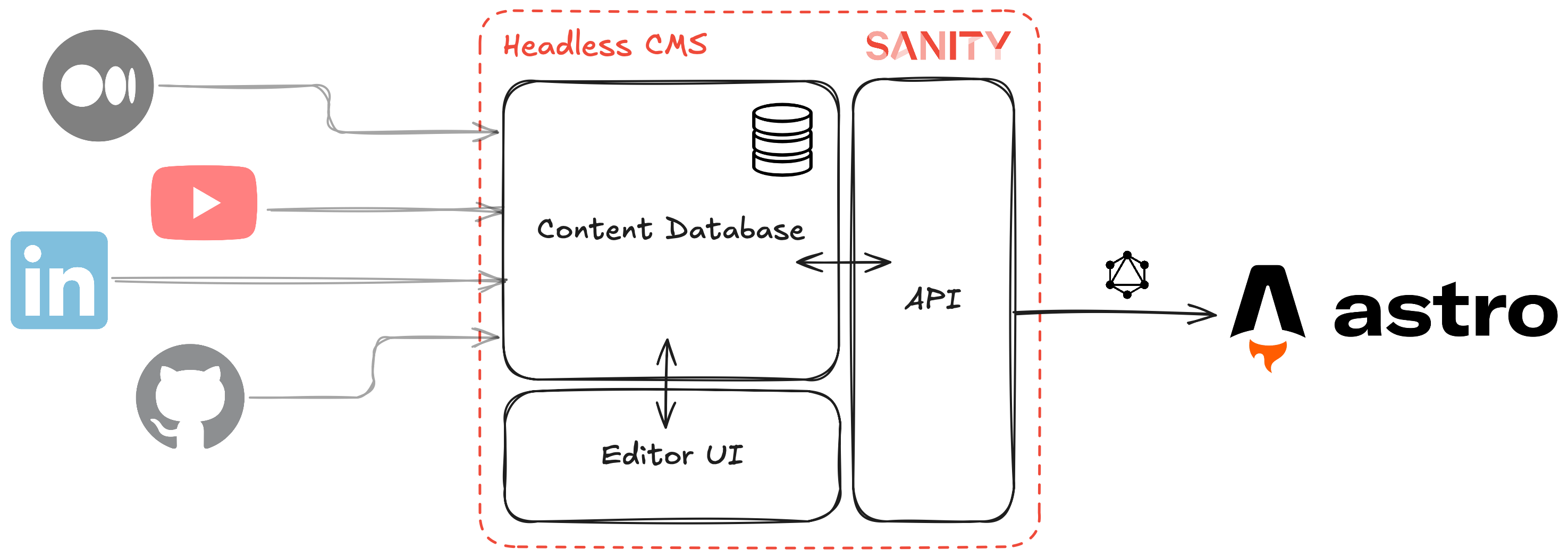
That’s when I remembered a video I’d seen about headless Content Management Systems (CMS)—essentially the backend of a CMS, built for developers. It sounded perfect: the convenience of a visual interface for editing content, paired with the freedom to define my data model however I wanted.
A bit of Googling led me to Sanity.io, which checked all the boxes:
- A generous free tier.
- Complete flexibility to design my content structure.
- A sample project demonstrating seamless integration with Astro.
The deal was sealed. With Sanity as my content backend, I could easily manage posts, images, and metadata while keeping the frontend sleek and focused.
The Supporting Cast: Styling and Functionality
With the two major pieces in place—Astro for the frontend and Sanity for content management—it was time to add the supporting cast. Here’s what rounded out my stack:
- Tailwind CSS: For styling, because who has time to write CSS from scratch? Tailwind made it easy to build a clean, consistent aesthetic that matched my vision.
- React and ShadCN/UI components: While Astro handled the static site, I used React for UI components that needed to be dynamic or I didn't feel like reimplementing. ShadCN/UI saved me time by providing pre-built, customizable UI elements.
- Vanilla JavaScript: For everything else, keeping things as lightweight and straightforward as possible.
- PrismJS: To make code blocks visually pleasing, I implemented syntax highlighting using this library.
The result? A happy mix-and-match of tools that came together seamlessly to build a site I’m proud of.
Why This Stack Worked for Me
At its core, my tech stack reflects two priorities: performance and simplicity. I hate sluggish experiences and long load times, so choosing tools like Astro ensured my site remained lightning-fast. Meanwhile, Sanity gave me the flexibility to organize and edit my content without hassle.
Even as a novice in web development, I found the process surprisingly fun. Every tool taught me something new, and the more I tinkered, the more confident I became. By the end of it, I had something that not only solved my initial problem but also pushed me to expand my skillset.
Now, with the groundwork laid, it’s time to take this project live. Let’s get ready to ship v1!
Deployment: Taking It Live
After first testing Netlify—which worked just fine—a friend asked, “Why don’t you use GitHub Pages?” He had a point. GitHub Pages is free, supports custom domains, and my site is lightweight enough that performance on the provided machines wouldn’t be an issue. So, that’s exactly what I did. One less service to worry about, and it made the CI/CD process straightforward.
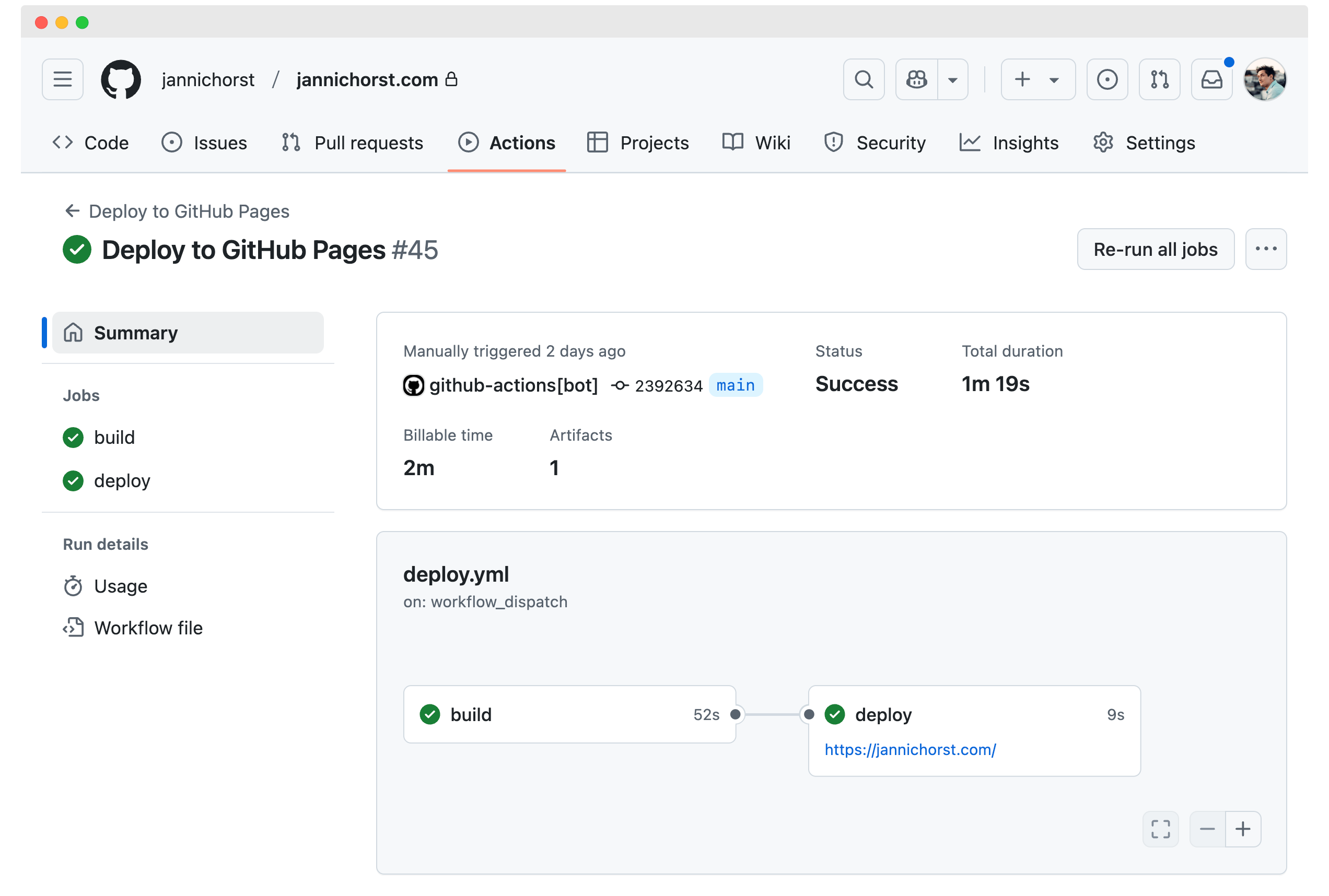
With a simple GitHub Actions workflow in place, my site now builds and deploys automatically whenever I push to the main branch. Easy peasy, lemon squeezy.
Automating All the Things
But why stop there? Developers love two things: free tools and spending hours automating tasks that only take minutes. Naturally, I had to do the latter.
Enter another GitHub Action I implemented—this one to sync my YouTube channel with my CMS (Sanity). Here’s how it works:

- The action runs weekly and calls the YouTube API to fetch my videos.
- It checks which videos aren’t yet referenced in any posts in Sanity.
- For each new video, it creates a post with:
- The video thumbnail, title, and link.
- A short AI-generated summary of the video content.
- Relevant tags for easy categorization and discovery.
All of this happens automatically, so every time I upload a new video to YouTube, it’s ready to appear on my site after the next deployment. If needed, I can later add more links, blog articles, or other content in Sanity.
A Smooth Ride
Deploying a live site like this was a first for me, but it wasn’t my first rodeo with GitHub Actions. Setting up the CI/CD pipeline was relatively smooth, and the Python script for syncing YouTube content worked like a charm. In the end, it’s satisfying to know that my workflow is as streamlined as the site itself.
Challenges: Hurdles and Lessons Learned
Doing something for the first time always comes with its share of tough moments. Building this site was no exception. But in my experience, if you can find a way to maintain momentum, those moments become much easier to handle. That said, I definitely hit a few roadblocks—both big and small—that forced me to rethink plans, rewrite components, or even take a step back when I realized I was chasing the same solution over and over.
Starting out in web development meant diving into a new world of challenges, especially with niche problems. The more specific the issue, the harder it was to find documentation or examples that matched what I was trying to do. Suboptimal documentation became an unwelcome companion, and progress often involved trial and error.
Cracking the PortableTextSchema Puzzle
One particularly memorable hurdle was expanding Sanity’s PortableTextSchema. This schema is a fantastic feature that allows you to customize how blog content is structured and rendered. For instance, I could add new custom block types—like code blocks—to fit my needs and handle them appropriately in the frontend.
// part of the blog post schema definition for Sanity...{type: 'code',title: 'Code',options: {language: 'python',highlightedLines: true,withFilename: true,languageAlternatives: [{title: 'Python', value: 'python'},{title: 'SQL', value: 'sql'},{title: 'JSON', value: 'json'},{title: 'Shell', value: 'sh'},{title: 'Bash', value: 'bash'},{title: 'YAML', value: 'yaml'},{title: 'JavaScript', value: 'javascript'},{title: 'SAS', value: 'sas'},{title: 'HTML', value: 'html'},{title: 'CSS', value: 'css'},{title: 'Docker', value: 'docker'},],},}...
In theory, it was great. In practice? It took a moment. The concept itself was flexible, but there weren’t enough examples showing how to implement it for my specific use case. But eventually, I figured it out, and now the custom blocks integrate seamlessly with the rest of my site.
The Usual Web Dev Shenanigans
Beyond the niche challenges, there were plenty of classic web development struggles. Layout issues, responsiveness quirks, and the ever-evolving complexity of CSS all made their appearances. These were the kinds of problems where even small changes could ripple out, breaking other parts of the site. It was a constant dance between fixing one thing and not unintentionally wrecking another.
Finding Solutions That Work
In the end, I found a solution to everything. Were they always elegant? Probably not. But they worked, and that’s what mattered. Every hurdle was a chance to learn something new, and overcoming them made the finished product even more rewarding.
If there’s one takeaway, it’s this: tackling something unfamiliar will always be tough, but sticking with it—taking breaks when needed, trying new approaches and sometimes just accept a "good enough solution"—pays off. For me, the journey of solving these challenges was just as satisfying as seeing the final site come to life.
Conclusion: A Journey to Be Proud Of
To summarize where I’m at right now: I’m genuinely happy. I can proudly say that I’ve achieved what I set out to do. I’ve created a space that brings together all my projects—a place that not only showcases my work but also feels like me. It represents my style, my vision, and my goals, while offering a worthy home for everything I’ve built.
Beyond the technical accomplishment, there’s immense satisfaction in tackling something I’d never done before. This was an idea I’d been thinking about for years, and turning it into reality was an incredibly rewarding process. Even the small design details, the ones that survived the long journey from Figma sketches to the final product, bring me joy every time I see them.
And as you’re reading this on the site itself, it’s clear: I consider it ready for the world.
Looking Ahead: What’s Next?
Of course, projects like this are never truly finished. There’s always room for improvement, kinks to iron out and I already have a few ideas brewing to further enhance the experience for visitors:
- ☑️ [TODO] Revamping the “About” Page: Right now, it’s pretty bare bones and could use some love.
- ✅ [DONE] Adding an Events Page: A space to list webinars, meetups, and other events where I’ve been a speaker—both online and offline.
- ☑️ [TODO] Improving Content Filtering: While the tag system is functional, I want to make browsing my library even more intuitive and seamless.
- ☑️ [TODO] Add a reading time estimation: I like those, and with this post already being this long, it might even be necessary.
- ☑️ [TODO] SEO optimisation: I'm not trying to pull lots of traffic but if somebody was looking for it, they might as well find it.
- ☑️ [TODO] Fix Styling Problems: Yes, there are still some.
- ☑️ [TODO] Fullscreen images: Displaying diagrams on mobile is a challenge as the text might be very hard to read.
These are just a few examples, but they highlight the fact that this site is a living, evolving project—much like the work it showcases.
The Real Challenge Begins
This journey, from idea to concept to launch, has been a fun and fulfilling one. But now, the hard part begins: creating content. This site is ready to house whatever I create next, and I’m excited to see where it takes me. So, let’s see how this next chapter unfolds!
Wanna see how I'm doing, visit me over at YouTube, check out my Github Profile or shoot me a message on LinkedIn.